Designing for Democrats

For about a year I have been in charge of the design of the Downstate Young Democrats, meaning the 5 boroughs of the Greater New York Metropolitan area (minus the Bronx because they don't yet have a chapter). One of my projects involved creating an overarching interface which would not only represent the individual county but also indicate that it was part of the greater Young Democrats organization in the city.

These screens are the first two sites that have been created, for Staten Island and Queens County. Staten Island came on board earliest, and the design convinced Queens that they too wanted a new site. The sites are intended to draw in newcomers, and keep members in the community up to date on Young Democrat events. Some dynamic features which allow members can update include a blogroll on the front page, the carousel for ongoing updates, and a gallery for images members can upload to via Flickr.


Although not yet implemented, this is a taste of how the Staten Island and Queens County  Young Democrats sites will look when finished. While each county retains individuality via an iconic representations of  the county, they will also maintain unification as the Young Democrats brand through the aesthetic implementation of typography, color, graphic elements, though implemented in subtly different ways.


These are samples of the each tab for Queens:

Adventures in Time Tracking Prototypes, Round 2

Old home screen (L) vs. new home screen (R)


 After a brief pause in designing, wherein we received user feedback on the heuristics of our design, we sat down to evaluate the changes and refinements necessary to our time tracking prototypes. There is a lot to be said for bashing heads with your team members to create efficient, minimal prototypes, and the arduous process of slowly whittling away at unnecessary details to bring out the most important features of our application. 


We spent much of the day with this whiteboard after touching on necessary fixes to the prototype. Mapping out the flow of each screen was extremely helpful to help us realize how each section of the app would interact with others. We figured out what was needed to contribute to the flow, and more importantly, what elements were redundant and/or unnecessary to the application.

Stay tuned for the latest prototype images!

Adventures in Time Tracking Prototypes, Round 1


These prototypes are far from perfect but they were a great learning experience. So many things became necessary to consider once sketching started. Even more ideas of what needed to be communicated arose when testing it out on classmates.

Contextual Inquiries, Affinity Diagramming, Persona Generation, Oh My!


User Interface Design, Info 213, has a fair number of my fellow first years in attendance. Professor Tapan Parikh really wasted no time getting us to pitch ideas and form groups of 3-5 people. My group includes Naila al Khalawi, Sean Chen, Donghjuk Jung, and Chan Kim. Through contextual inquiries, diagramming our findings, and generating insights we came to ask the question:

How might we help people create efficient scheduling habits that integrates their work and life to achieve greater balance between the two?

Our proposal: To create an application which allows users to track their time so as to get a better view of how it is actually spent versus how they think it is spent. We think that having an overview of actual time spent would better help people make the necessary adjustments to balance out and schedule their activities.

Apocalypse Now? | Fall 2011

Our team wanted to have some interpretive fun with large data sets and so the concept of the project was very important. We came up with the idea mashing up CDC data with map visualizations to see where the end of the world was likely to start, at least within the United States. Unfortunately we were unable to aggregate all four elements of the Apocalypse onto one map and so could only make do with self comparisons.


Snobriety Test | Fall 2011

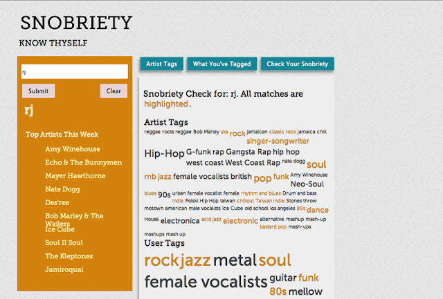
One of the tenants espoused by Cory Doctorow in "Metacrap" emphasized the fact that what people say they do often does not align with what they actually do. Taking that principle in mind, we decided to see if the tags users created in association with their musical preferences on Last.fm aligned with what they were actually listening. Using the Last.fm open API we pulled the artists users had listened to that week and in a word cloud mash up compared those tags to the ones users created. Similarities were highlighted, creating a quick visual reveal of the truth in their actions. Vast disparities would show that the users are not as true to their musical preference as they purport, and would deliver a sobering reality.