Our team wanted to have some interpretive fun with large data sets and so the concept of the project was very important. We came up with the idea mashing up CDC data with map visualizations to see where the end of the world was likely to start, at least within the United States. Unfortunately we were unable to aggregate all four elements of the Apocalypse onto one map and so could only make do with self comparisons.
Snobriety Test | Fall 2011
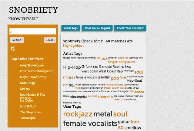
One of the tenants espoused by Cory Doctorow in "Metacrap" emphasized the fact that what people say they do often does not align with what they actually do. Taking that principle in mind, we decided to see if the tags users created in association with their musical preferences on Last.fm aligned with what they were actually listening. Using the Last.fm open API we pulled the artists users had listened to that week and in a word cloud mash up compared those tags to the ones users created. Similarities were highlighted, creating a quick visual reveal of the truth in their actions. Vast disparities would show that the users are not as true to their musical preference as they purport, and would deliver a sobering reality.
Subscribe to:
Posts (Atom)

